Line Chart
The Line Chart widget compares up to four Homey insights in a single graph so you can spot correlations, trends, or outliers. Click any point to open a tooltip with detailed values.
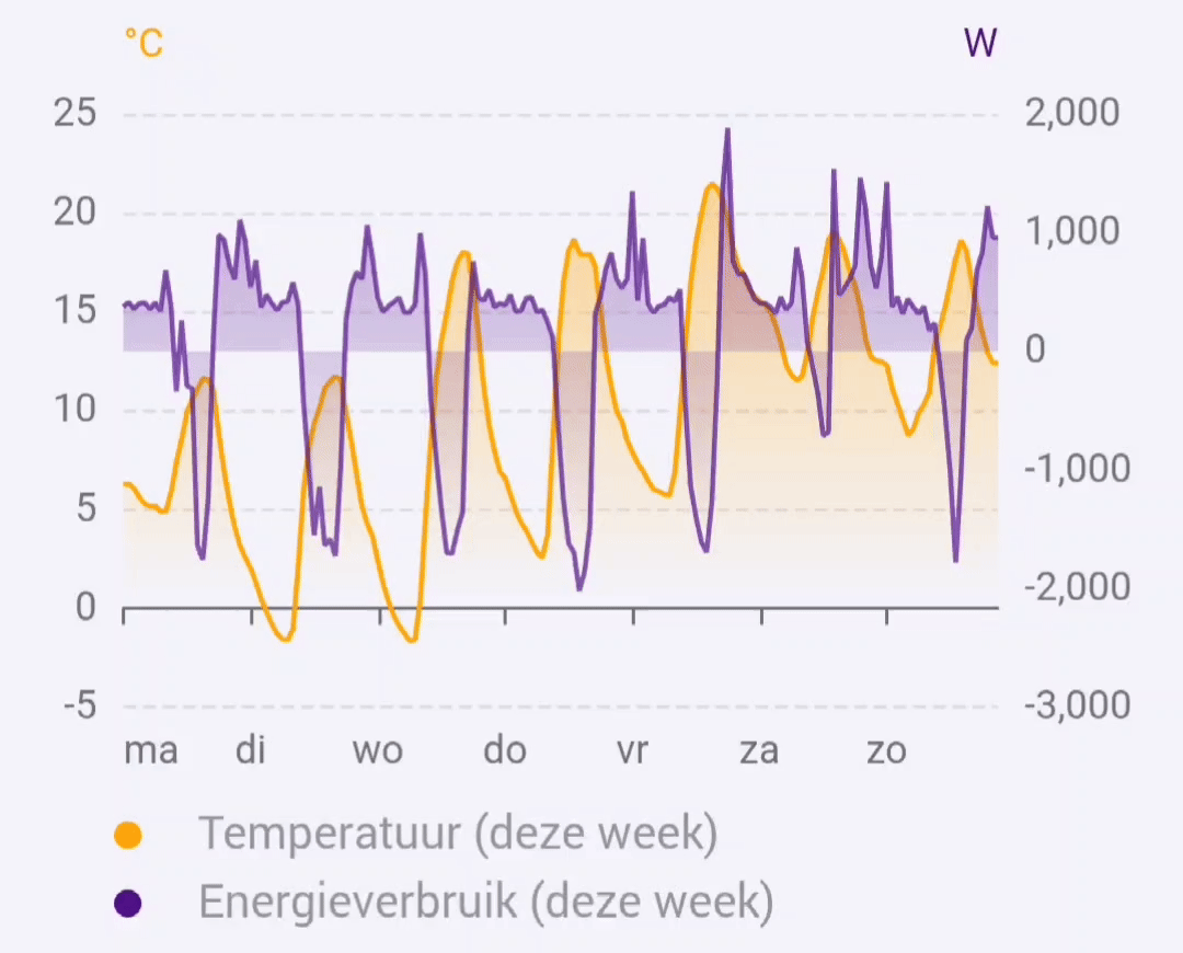
Currently the widget visualizes Homey insights.
Add the widget to your dashboard
- Open the Homey app and go to Dashboards.
- Enter Edit Mode and select Add Widget.
- Choose Apps and select DataVista.
- Pick the Line chart widget.
- Click the preview to add it to your dashboard.
Configure the widget
| Setting | Description |
|---|---|
| Timeframe | Choose a fixed period (hour, day, week, month, year) or a rolling window (60 minutes, 24 hours, 7 days, 31 days, 365 days). |
| Show refresh countdown | Display a progress bar that counts down to the next data refresh. |
| Y axis calculation method | Pick Full range, Interquartile Range (IQR), or Force same axis to control how the Y axis is calculated and whether a second axis appears. |
| Y-Axis minimum | Optional lower bound for the Y axis. When set, the axis will not go below this value. If the data itself goes lower, the axis scales automatically. Leave empty for fully automatic scaling. |
| Y-Axis maximum | Optional upper bound for the Y axis. When set, the axis will not go above this value. If the data itself goes higher, the axis scales automatically. Leave empty for fully automatic scaling. |
| Hide legend | Hide the legend (disables per-series toggles). |
| Legend font size | Select Small, Normal, or Large for legend text. |
| Tooltip font size | Select Small, Normal, Large, or Extra large for tooltip text. |
Per-datasource settings
The widget supports up to four datasources. Each datasource (1–4) has the following settings:
| Setting | Description |
|---|---|
| Datasource | Select a Homey insight series. Datasource 1 is required; 2–4 are optional. |
| Period | Choose whether to show the current or previous period relative to the timeframe. |
| Color | Line color for the datasource. |
| Overwrite name | Optional label override for the datasource. |
FAQ
How do I compare this period against the previous one?
Select the same insight in two datasource slots (for example 1 and 2), then set one to This period and the other to Last period.
How do I use rolling timeframes?
Pick one of the rolling options (for example 60 minutes or 7 days). Fixed periods (such as day or month) follow calendar boundaries.
What does "Y axis calculation method" do?
This setting controls how axis bounds are calculated and when datasets share an axis:
- Full range includes all data points when calculating axis bounds. Datasets with different units or vastly different value ranges get separate axes.
- Interquartile Range (IQR) excludes outliers when calculating axis bounds, preventing extreme values from compressing the rest of the chart. Datasets with different units or vastly different value ranges get separate axes.
- Force same axis puts all datasets on a single axis regardless of units or value ranges. The axis label uses the first datasource's unit.
Does the chart refresh automatically?
Yes, it refreshes in line with the corresponding Homey insights update cadence.
How do I close a tooltip?
Click the X-axis or Y-axis to dismiss the tooltip.
Why do I see multiple Y axes?
The widget automatically creates separate axes when datasets have different units or vastly different value ranges. To force all datasets onto a single axis, set Y axis calculation method to Force same axis.
How do I hide or show individual lines?
Click the legend items below the chart to toggle visibility of each line.
What do the dates in parentheses mean in tooltips?
When comparing different periods (for example this week vs last week), the data is aligned so lines overlap on the X axis. The tooltip shows the aligned date as the main timestamp, with the actual date from the previous period shown in parentheses.