Gauge
The Gauge widget provides a dynamic way to display numerical data such as temperature, humidity, or battery levels. Configure the widget to match your needs with adjustable ranges, colors, and styles.
There are two gauge variants:
- Simple Gauge: Fully configurable from the widget settings.
- Advanced Gauge: Configured via DataVista action cards for complete control over data and visualization.
Add the widget to your dashboard
- Open the Homey app and go to Dashboards.
- Enter Edit Mode and select Add Widget.
- Choose Apps and select DataVista.
- Pick the Gauge widget.
- Click the preview to add it to your dashboard.
Configure the Simple Gauge
The Simple Gauge is configured entirely through widget settings:
| Setting | Description |
|---|---|
| Datasource | Select a device capability to provide values. The widget uses its current, minimum, and maximum values when available. |
| Number of segments | Sets the number of gauge segments; each segment border shows a value. |
| Refresh interval (seconds) | Seconds between polling updates. |
| Minimum value | Override the capability minimum. |
| Manual minimum value is negative | Treat the manual minimum as a negative number. |
| Maximum value | Override the capability maximum. |
| Manual maximum value is negative | Treat the manual maximum as a negative number. |
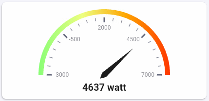
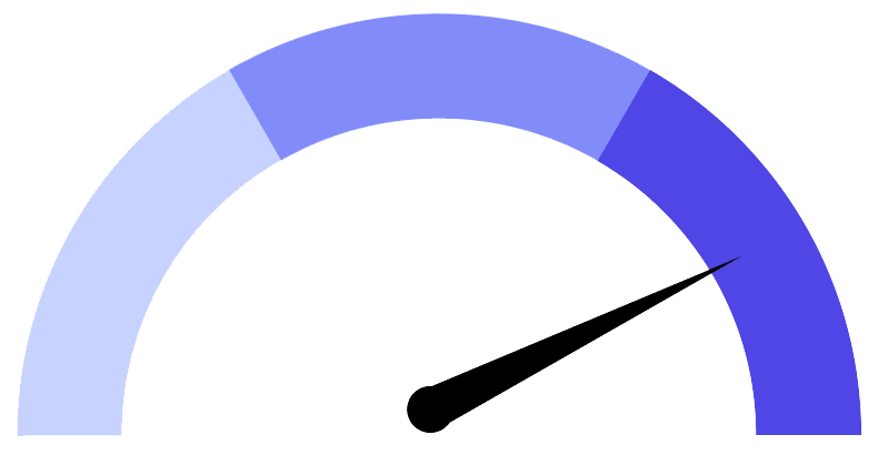
| Style | Choose Style 1, Style 2, or Circular. Style 1 uses a needle, Style 2 a colored bar, and Circular renders a 360° dial. |
| Transparent background | Toggle between a solid tile or transparent background. |
| Color 1 | Color at the minimum value. |
| Color 2 | Color at the midpoint. |
| Color 3 | Color at the maximum value. |
Configure the Advanced Gauge
The Advanced Gauge relies on DataVista action cards and offers more flexibility:
| Setting | Description |
|---|---|
| Datasource* | A DataVista datasource (percentage or range) that feeds the gauge. |
| Configuration source* | A DataVista configuration that defines gauge colors and offsets. |
| Number of segments | Sets the number of gauge segments; each segment border shows a value. |
| Style | Choose Style 1 (needle), Style 2 (colored arc), or Circular (360° dial). |
| Transparent background | Toggle between a solid tile or transparent background. |
The datasource must be created by running a DataVista action card that sets a percentage or range at least once before it appears in the widget settings.
The configuration source requires a DataVista action card to define gauge colors. Run it once before selecting it in the widget settings.
Tutorials
FAQ
Why does the gauge animate through 0, 25, 50, 75, and 100?
The datasource could not be found or is no longer available. Reconfigure the datasource setting and select a valid value.
How do I render a circular gauge?
Select Circular in the Style setting to render a round 360° gauge.