Tutorial: Visualizing Hourly Energy Prices with a Gauge
The Gauge widget can display hourly energy prices. This guide walks through configuring a gauge that updates with real-time price data.
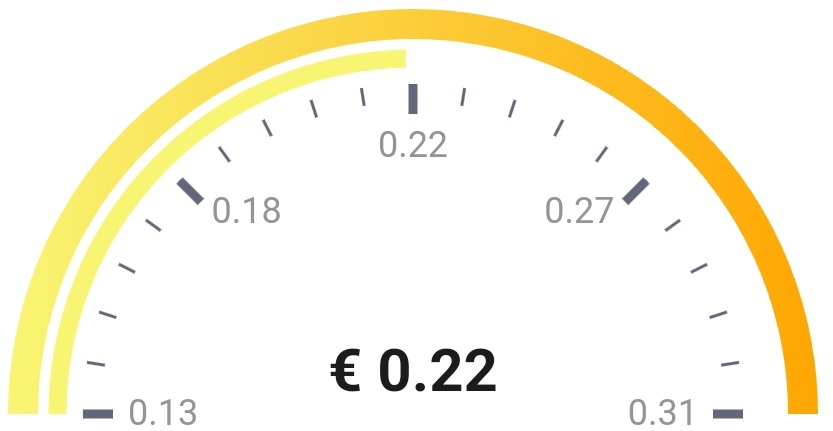
You need a Homey capability or variable that provides the lowest price of the day, the highest price of the day, and the price for the current hour. The Power by the Hour app is one option.
Each flow card in the sequence should connect to the previous card to ensure the actions run in order.
1. Create a periodic trigger
Create a Homey flow triggered every hour (or when a new price hour starts).
2. (Optional) Format the price token
Optionally run an action card (for example from Better Logic Library) to format the price token, such as rounding to two decimals.
3. Set the range and current price
Use the DataVista range action card to define the datasource.
- Choose an identifier, such as Hourly energy price.
- Set the minimum and maximum values using the lowest and highest prices, or fixed values like
0and2. - Assign the current price token to Value.
- Set the unit to your currency (for example
€) and choose whether it appears before or after the value. - Keep the default label unless you plan to show a custom text value.
Overwrite the label when you want to show qualitative values (for example Low, Moderate, High). Add logic before this card to map the numeric price to a text token, then select that token in Overwrite label.
4. Configure the visualization
Use the DataVista gauge configuration action card to define the color bands.
- Create an identifier such as Visualization for hourly energy price.
- Add axes colors for your thresholds, for example green at
0, yellow at0.10, orange at0.30, and red at1. - Leave any unused offsets blank—they will be ignored.
You can populate the color offsets dynamically with tokens. This lets you adapt thresholds (for example, higher red thresholds during winter).
5. Add the widget to the dashboard
Follow the Gauge widget setup to add an Advanced Gauge. Select the datasource from step 3 as the value source and the configuration from step 4 as the visualization.