Scatter Plot
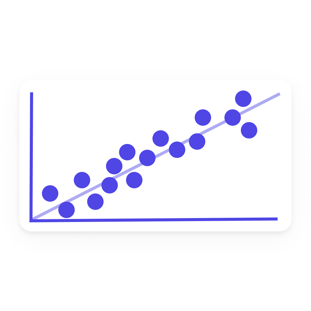
The Scatter Plot widget pairs two Homey insights by timestamp and plots them against each other, helping you spot correlations between metrics — for example outdoor temperature versus heating power, or solar production versus battery state of charge.
Currently the widget visualizes Homey insights only.
Add the widget to your dashboard
- Open the Homey app and go to Dashboards.
- Enter Edit Mode and select Add Widget.
- Choose Apps and select DataVista.
- Pick the Scatter plot widget.
- Click the preview to add it to your dashboard.
Configure the widget
| Setting | Description |
|---|---|
| Timeframe | Choose a fixed period (hour, day, week, month, year) or a rolling window (60 minutes, 24 hours, 7 days, 31 days, 365 days). |
| X-axis | Select the Homey insight to plot on the horizontal axis. |
| Color | Marker color for the scatter points (and trendline if enabled). |
| Overwrite X-axis name | Optional label override for the X-axis datasource. |
| Y-axis | Select the Homey insight to plot on the vertical axis. |
| Overwrite Y-axis name | Optional label override for the Y-axis datasource. |
| Period | Choose whether to show the current or previous period relative to the timeframe. The same period applies to both axes. |
| X-axis minimum / maximum | Optional bounds for the X axis. Leave empty for automatic scaling. |
| Y-axis minimum / maximum | Optional bounds for the Y axis. Leave empty for automatic scaling. |
| Show trendline | Overlay a linear regression line through the points to visualise the relationship. |
| Show correlation (R²) | Display the Pearson coefficient of determination in the chart header. Values close to 1 indicate a strong linear relationship; values close to 0 indicate little to no linear relationship. |
| Show sample size (n) | Display the number of paired data points plotted. If some timestamps could not be matched between the two datasources, the individual totals are shown in parentheses. |
| Show refresh countdown | Display a progress bar that counts down to the next data refresh. |
| Tooltip font size | Select Small, Normal, Large, or Extra large for tooltip text. |
FAQ
How are points paired between the two datasources?
Both datasources are fetched at the same insights resolution, so their bucket timestamps align. Each X point is paired with the Y point at the same timestamp. If a bucket is missing on one side, that point is skipped — only fully aligned pairs are plotted.
Why does the chart say "No overlapping data"?
Both datasources are configured but no aligned data points were found in the selected period. This usually means one datasource has no values for this period (for example, the device was offline), or the two datasources record at very different cadences.
What does the "n=…" footer mean?
It shows how many paired data points are plotted. When some timestamps could not be matched between the two datasources, the individual totals are shown in parentheses — for example n=180 (X: 251, Y: 200) — so you can see how many points were dropped on each side.
What does R² tell me?
R² (the coefficient of determination) measures how well a straight line fits the points: 1.0 means a perfect linear relationship, 0.0 means no linear relationship. It says nothing about non-linear correlations or causation — it is a quick sanity check, not a statistical conclusion.
Does the chart refresh automatically?
Yes, it refreshes in line with the slowest of the two underlying Homey insights' update cadence.